Create a Professional Final Cut Color Grading Suite
Final Cut Studio is a powerful application suite that provides editors and post-production facilities with a highly capable and affordable solution for film, motion graphics and audio post-production. For color correction and color grading needs Apple’s new Final Cut Studio 7 and Color 1.5 combine with their new ProRes 4444 codec to provide extremely highquality color visualization without the loss of color information due to chroma subsampling.
However, to truly SEE the difference in such improvements in image quality, you must first make certain that the viewing environment for your FCS system is properly set-up and calibrated. Why is this so important you may ask? Allow us to illustrate with a simple demonstration. In the image below, the small boxes appear to be different shades of gray, right?
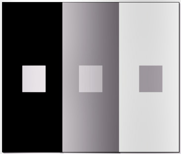
WRONG. They are each exactly the same value. However, the adjacent shade immediately surrounding each box effects the how the brain perceives the shade of the box. This is exactly the same effect that is introduced when looking at a specific color or range of colors on a video monitor in a room with mixed lighting, excessive contrast, colored walls and other visual distractions that impair and distort the viewers perception of on-screen colors.
The key to reproducing an accurate and repeatable representation of color and contrast is a properly configured calibrated viewing environment.
Such an environment is comprised of the following three elements:
- A neutral calibrated wall behind your monitor
- A calibrated desktop
- A properly lit room with calibrated contrast between the monitor screen and the area immediately surrounding the screen
We’ll look at each requirement and the solutions eCinema provides. First, a neutral calibrated wall behind your monitor is most easily achieved by painting the wall a neutral shade of gray. Can I get this at the hardware store? Not really. For precise colorimetry a complex formula is required. Household paint has variations from batch to batch which make the formula slightly different depending on when you get it mixed. And there's the problem of knowing exactly what that mixture should be.
eCinema has formulated a apecialized SP-50 Spectrally Flat Latex Paint specifically for this purpose. Optimal calibration will result from all walls and ceilings being the same neutral shade. It is also acceptable, however, to paint the wall directly behind the monitor and keep the rest of the room dark enough that any white walls are not illuminated. If you have colored walls and they are visible, they should be painted using SP-50 - spectrally flat latex paint.
Next, a properly illuminated room with calibrated contrast between the monitor screen and the area immediately surrounding the screen requires two elements.
- All light sources in the room should be 6500k daylight balanced
- The illumination immediately surrounding the monitor should be 25% (10% for CRT monitors) as bright as the full screen white luminance output of the monitor itself. This can be measured using a standard photographic light meter.
The reason for the surround illumination is so that your eyes can properly see image contrast and color saturation without compensating for either excessive or insufficient contrast. The surrounding light provides the proper balance between foreground and background luminance to ensure that the calibrated image is accurately perceived by your eyes and that image contrast is properly balanced. eCinema offers a compact desk, floor or wall mountable surround light fixture with variable output - the SLS-01 Surround Light System - to easily and affordably create the proper surround illumination characteristics for optimal viewing.
The third requirement is a calibrated video desktop. Ideally, all monitors in the field of view should be calibrated to exactly the same standard. For television the luminance range is 20 to 30 foot lamberts. For Digital Cinema it can go as low as 14 foot lamberts. This, however, is very difficult to achieve with consumer LCD monitors, which can be as much as five times brighter than a properly calibrated video monitor and ten times brighter than what's required for digital cinema.
Consumer computer monitor colorimetry is also very inconsistent. Most cannot be calibrated to any reasonable standard and will not match video monitors. As a result, colorimetry and calibration inconsistencies increase eye strain and fatigue and the disparity can make critical color evaluation error-prone or even impossible.
eCinema offers two complete desktop monitoring solutions - eDesk FX and eDesk PRO - that provide matched and calibrated Rec709 colorimetry across the entire desktop – GUI and video monitors.
At the very least, however, for color grading, one must have a primary video monitor that can be calibrated to REC 709, the SMPTE standard for broadcast HD video. RGB primary coordinates for REC 709 are:
- RED: x= 0.640 y= 0.330
- GREEN: x= 0.300 y= 0.600
- BLUE: x= 0.150 y= 0.060
If your primary video monitor uses a probe for auto calibration to the REC 709 standard, you are all set. If not, don’t scrimp here. You can forget about “eyeing it.” The human eye is not able to detect the subtle differences in color temperature, saturation and contrast that a color probe can. And we can virtually guarantee that if you attempt to set up your monitor by isolating the red, green and blue channels and adjusting it visually with reference charts such as SMPTE bars, you will not get it right.
For this reason, a primary video monitor MUST be able to be probe-calibrated to REC 709 to ensure that your viewing correct and accurate color space when grading. ALL eCinema monitors provide built-in automatic probe calibration and we offer professional models to suit every budget.
And there is one additional, often overlooked area of calibration to remember – calibrated eyeballs! Before making critical color decisions in the edit room you eyes have to adjust to the viewing environment for at least 15 minutes. When moving to a different environment the adjustment period must be repeated. During prolonged sessions "reset" your eyes by sending a full frame mid-gray or white signal to the monitor for two to five minutes. No need to stare at it. But do look at it and let your eyes "remember" what neutral looks like.
Never make small incremental corrections. That is guaranteed to drift your color into something that will look right but be wrong. Your eyes auto-adjust to small changes very quickly and will "lie" to you.
Think of what happens when you put on blue sunglasses...after a few seconds white objects look white again. The eyes auto-adjust to changes quickly. It is better to do several passes of the material than to try to get it perfect on the first pass. The eye's color adaptation process might very well make you over-paint a scene if you spend too much time on it.
If you follow these steps, with a properly calibrated room and video monitoring system, you can achieve critical color accuracy and be able to confidently grade color at a fraction of the cost of high-end color-grading suites.
Summary
- Paint the room with SP-50
- Install SLS-01 lights for best results
- Reduce or eliminate all other light sources
- Calibrate video monitors to REC-709 standards
- Calibrate data monitors to match video monitor
Accessories
SP-50 Specially formulated paint for Critial Color Evaluation environments. Used in order to achieve accurate and consitent perception of color.
SLS-01 Used to illuminate wall behind monitor in order to achive a calibrated surround illumination per SMPTE Critical Color Evaluation recommendations.